Client Work:
SCADPro Collaborative Design Studio X City of Atlanta (2024)
SCAD is currently working with the City of Atlanta to improve the accessibility of affordable, healthy food options for local neighborhoods, residents, and visitors. It’s a comprehensive collaboration that includes exploring the development and design of a retail establishment to service the community. Our brand, Azalea's, was chosen by the clients because it fulfilled the need for an authentic, accessible grocery store that was clearly designed for and by the people of downtown. As announced at the Mayor's State of the City Address in March, Azalea's will be implemented in 2025, having secured $11.5 million in funding.
I served as the sole illustrator on this project, which is an unforgettable experience that I will always be grateful for. In addition to providing custom illustrated patterns, I also designed spot and full-size illustrations to elevate the project's branding concepts. I adapted my illustration style to fit the more graphic and bold creative culture that Atlanta is known for. Additionally, I assisted in managing the project’s overall adherence to client guidelines and ensured consistency across all active divisions as an Art Director.
I am thrilled to share the wide range of assets that I created for this project. Please enjoy exploring the brand and learning more!
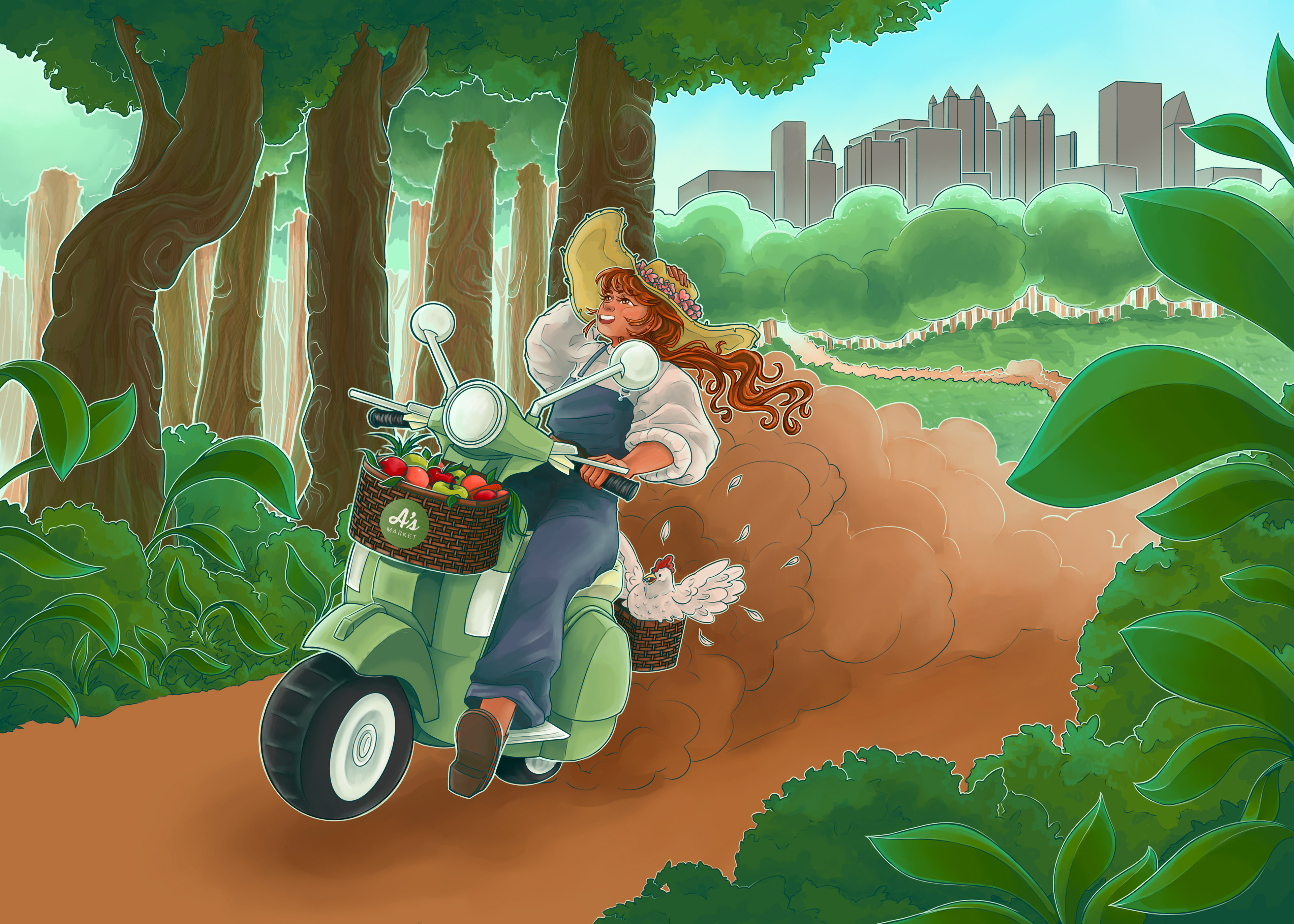

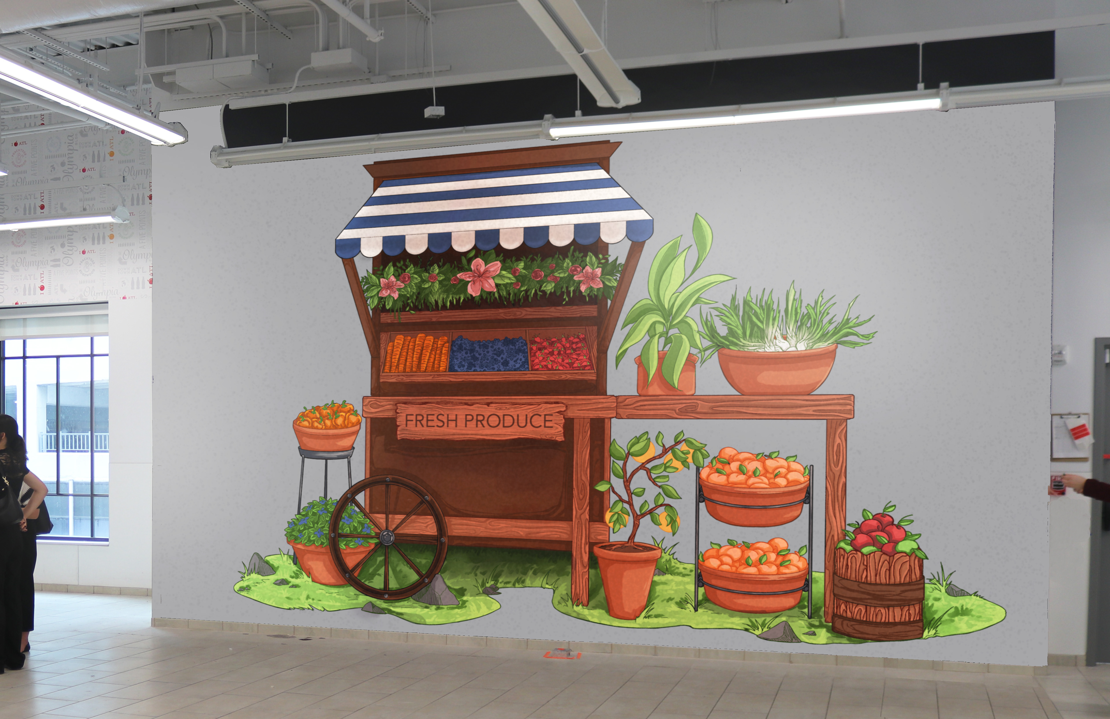
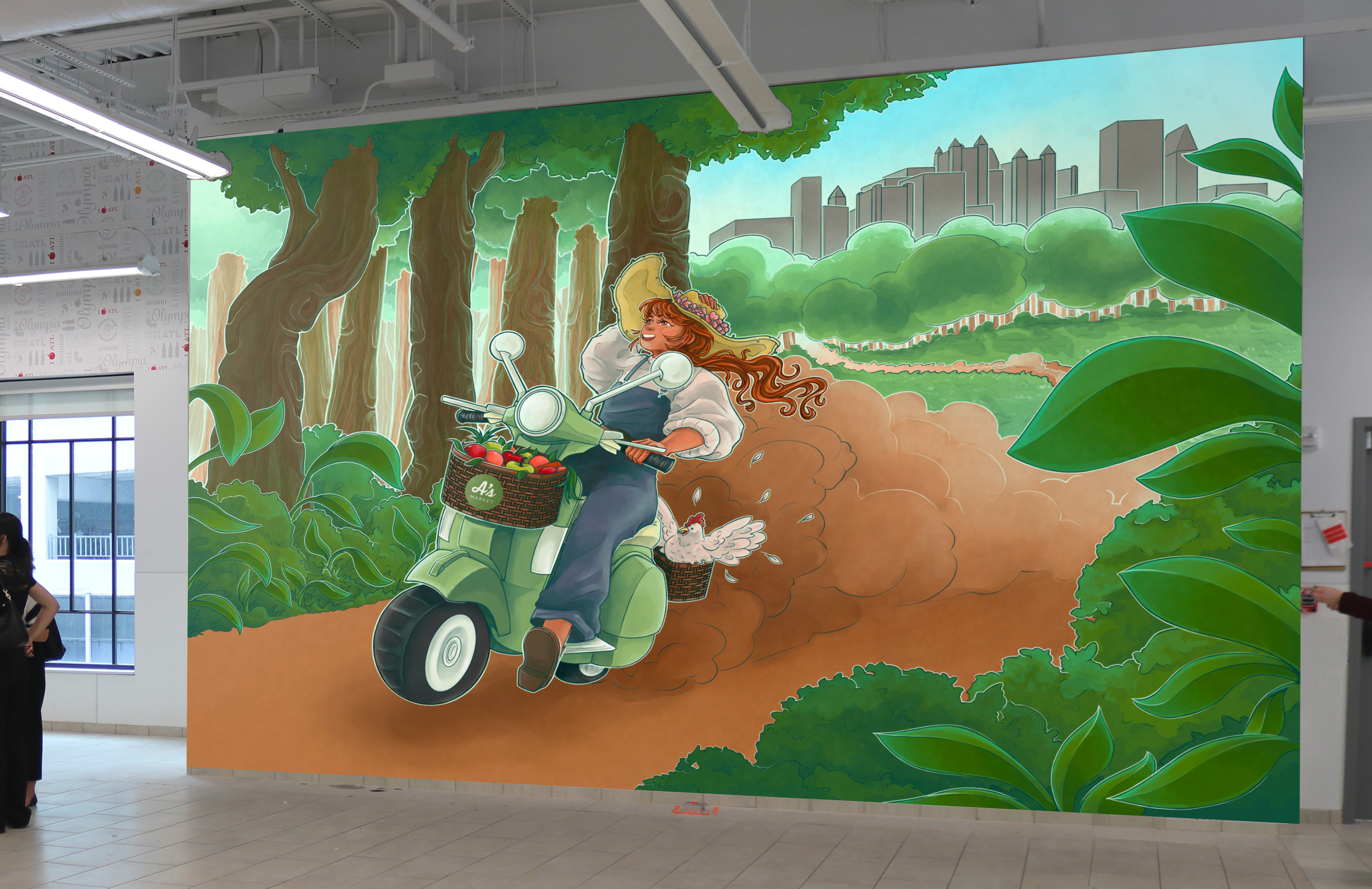
As the sole illustrator on a collaborative project, it was primarily up to me to determine which assets the branding concept needed and to fully develop them. One of my main initiatives was the idea of including murals in the brand package: combining the creative and lively culture of Atlanta street art with the welcoming and accessible nature of our brand. The produce stand was my original idea, meant to invoke the communal and locally-sourced feeling of a farmer's market. Later, as we continued to refine the branding concept, I developed the personification of the brand, which connects the local farmers and producers with the people living in the food deserts of Downtown Atlanta.

As I developed the character of the brand, a few questions were raised. What should she look like? What aspects of her appearance are important? How does she convey the brand values of freshness, accessibility, and quality? The entire team eventually decided on the first design, as she is easily recognizable, approachable, and generally ambiguous.

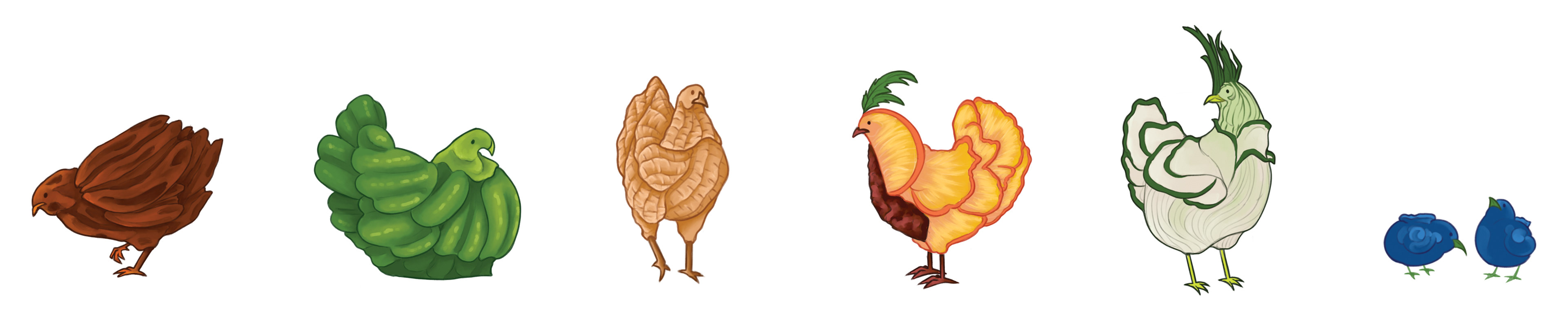
The most fun part: stickers! I created a variety of different cute creatures to use as potential marketing materials. Each one is correlated to the top produce items that Georgia generates and/or exports every year (also pictured in the patterns below!). Chickens were a cute and versatile way to create a humorous and enjoyable continuity throughout all of the visual material I illustrated. There are pecan chickens, bell pepper chickens, peanut chickens, peach chickens, spring onion chickens, and blueberry chickens to collect.
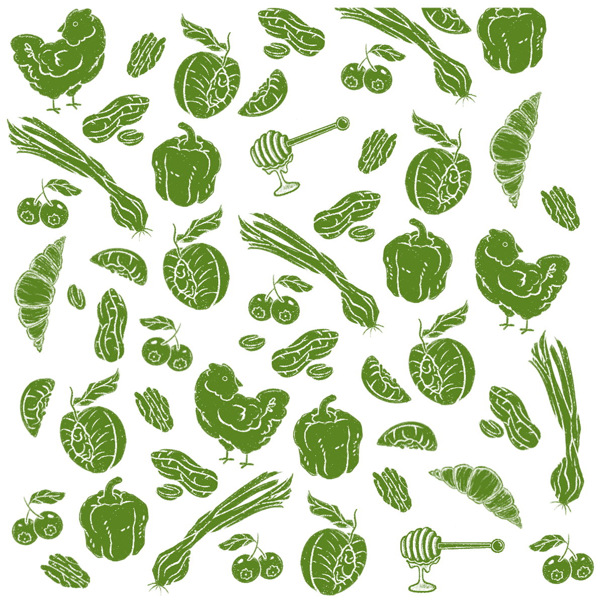


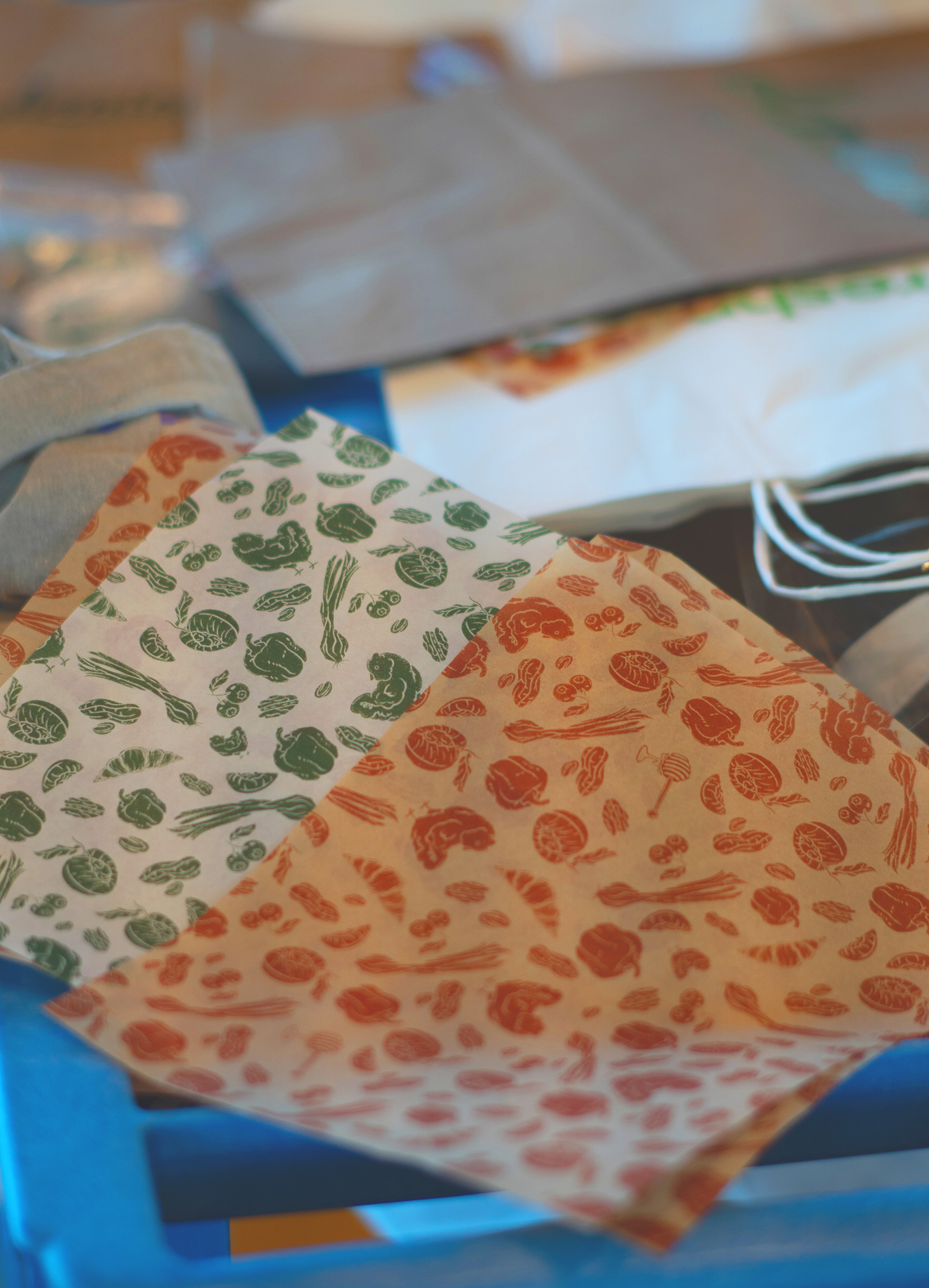
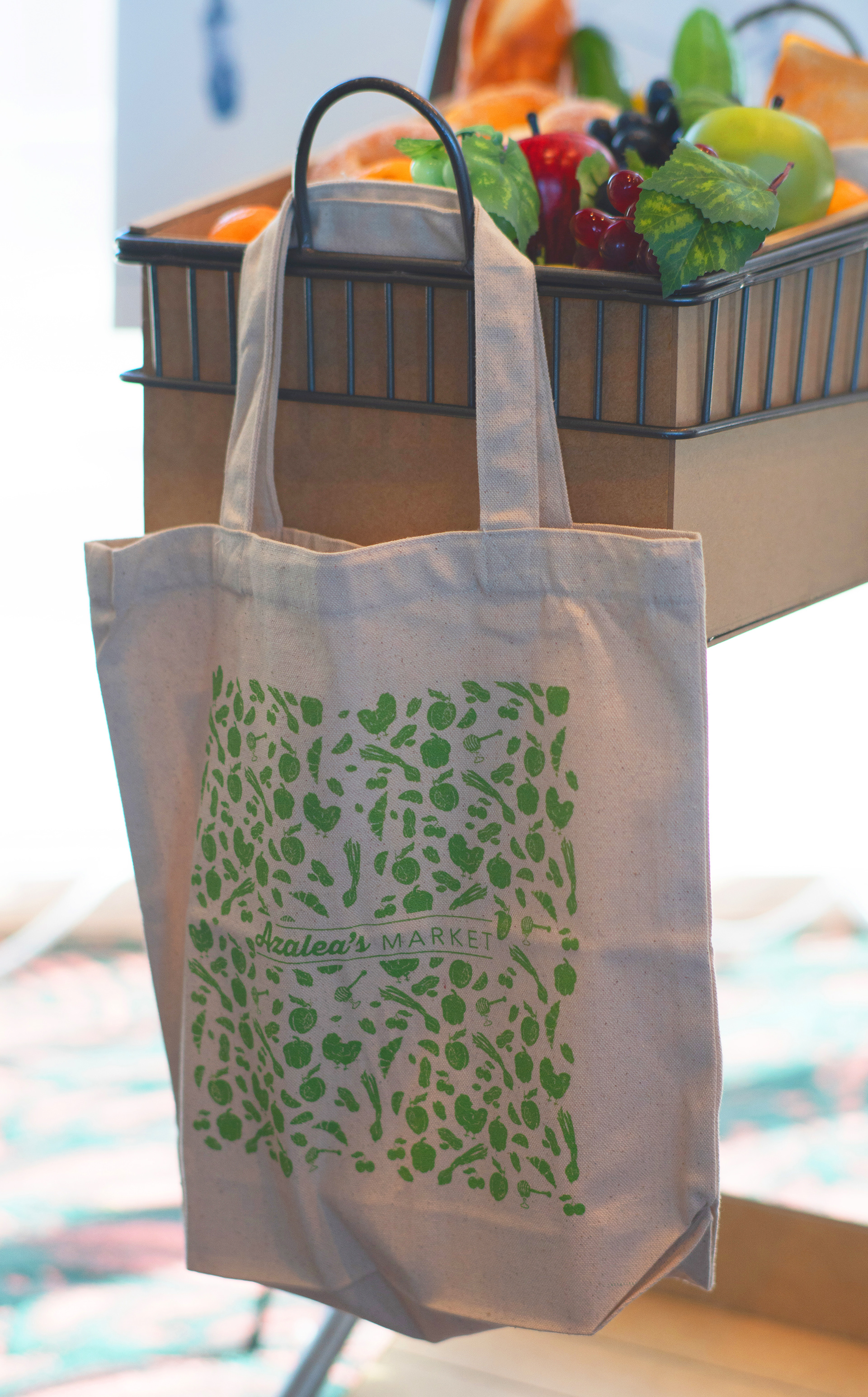
Finally, the idea that started it all: a simple pattern compromised of Georgia's top produce items to be used on a reusable paper or tote bag. The artisan and playful nature of the brand grew from this original initiative of mine. Getting to see my work printed on professional mock-ups for our final client presentation was an unbelievable opportunity that I will never forget.
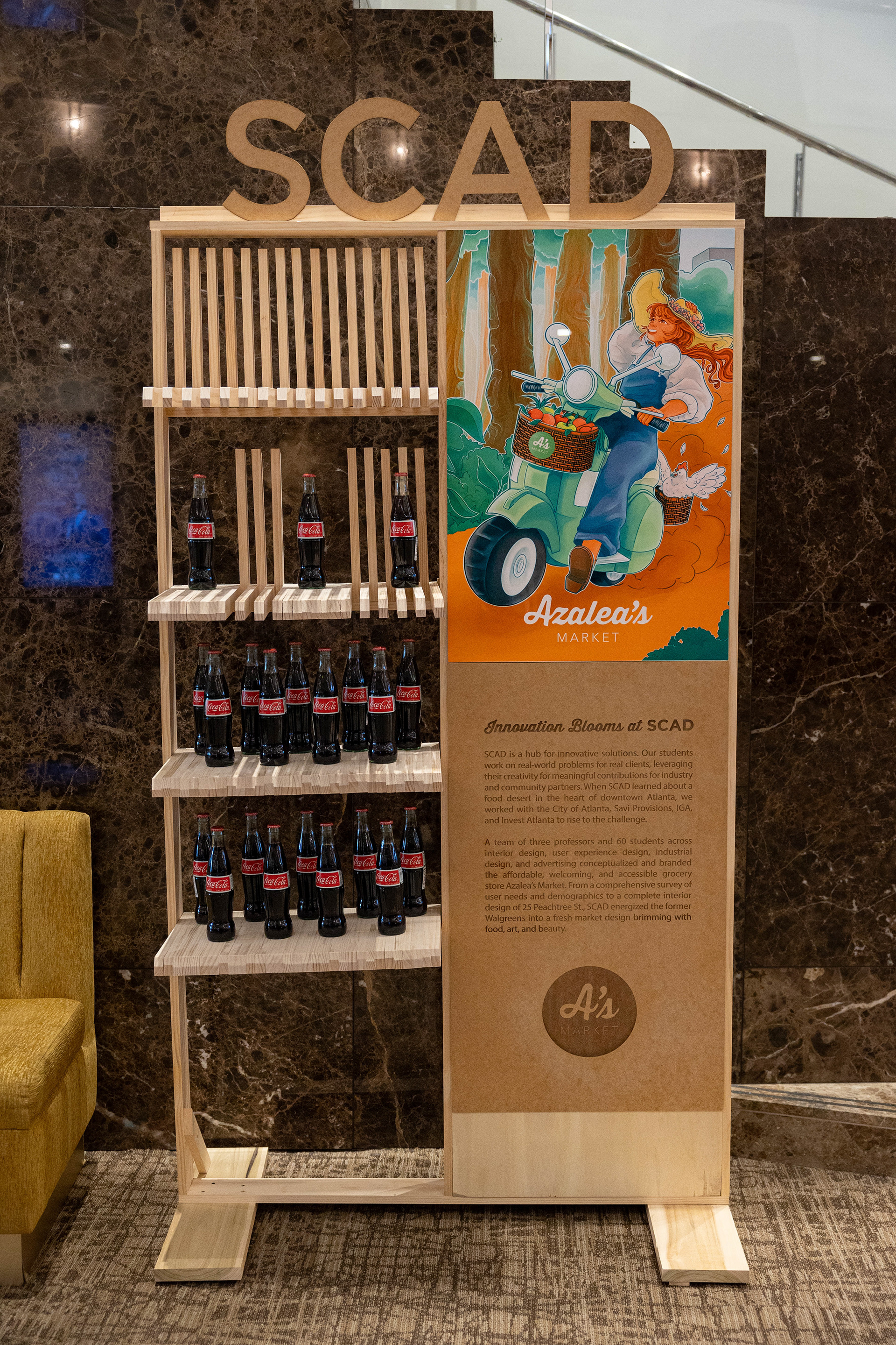


Mayor of Atlanta's 2025 State of the City Address; Azalea's display.
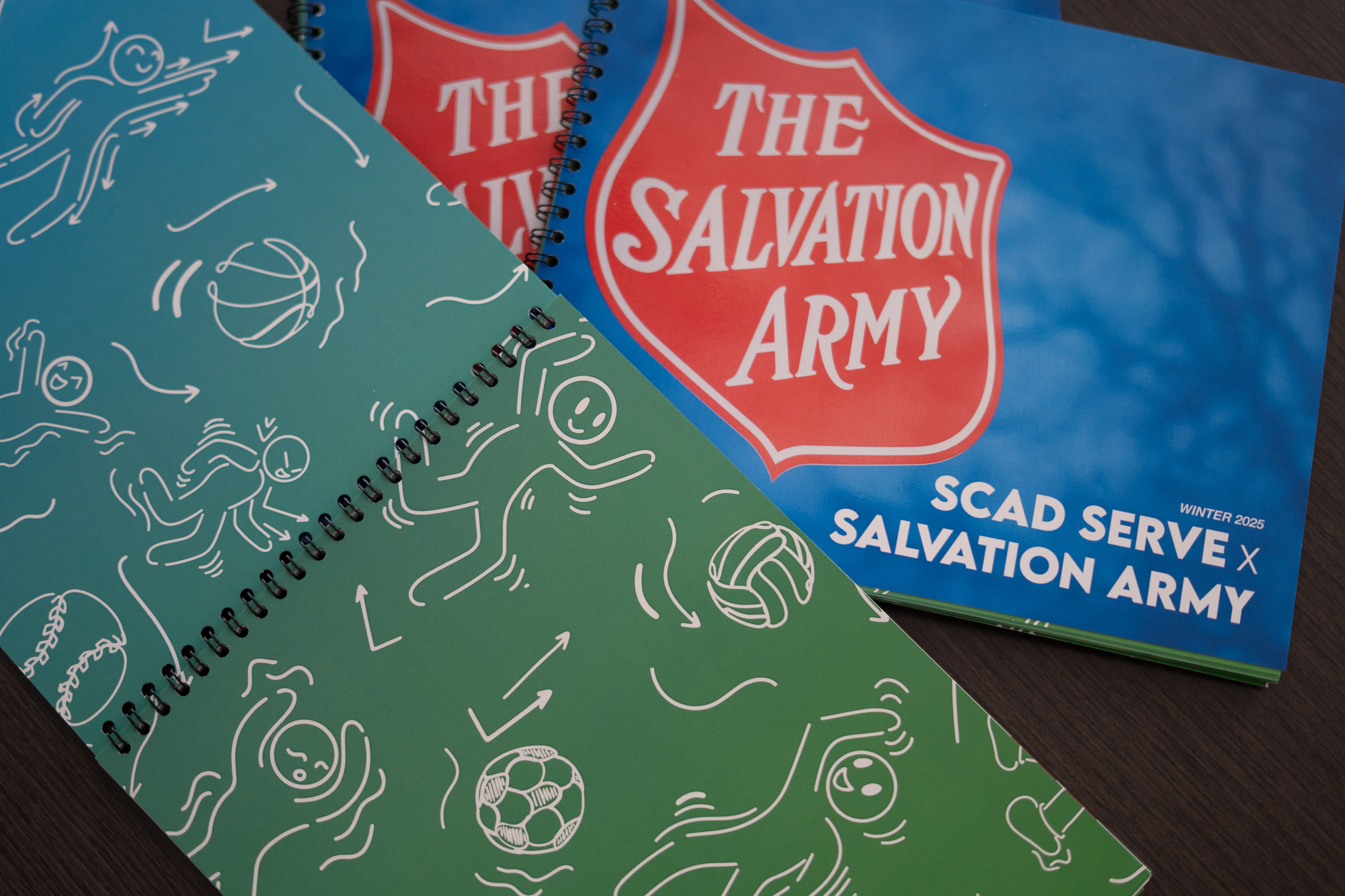
SCADPro Collaborative Design Studio X Salvation Army
Through SCADServe and the SCADPro Collaborative Design Studio, we collaborated with the Salvation Army to reimagine and revitalize unused pool spaces in two of their Atlanta youth center locations. The concepts we were responsible for researching, ideating, and presenting to the Salvation Army are designed to improve day-to-day operations, increase enrollment and retainment, and provide exciting experiences for the children in their communities.
I served as the Senior Illustrator and Creative Director of our team. In addition to directly managing the Concept Design team, I was responsible for conceptualizing and implementing our deliverables for this project, as well as leading our design and advertising teams to ensure total project consistency and goal completion as the Creative Director.
I greatly enjoyed this role because of how much I am learned from working with and helping direct my peers, as well as being able to explore how adaptable my own work is. It was an honor to have the opportunity to make an impact on kids and non-profit workers that deserve solutions as dedicated as they are. Enjoy learning about all of our hardwork on this project!
Midpoint: Introduction to Concepts
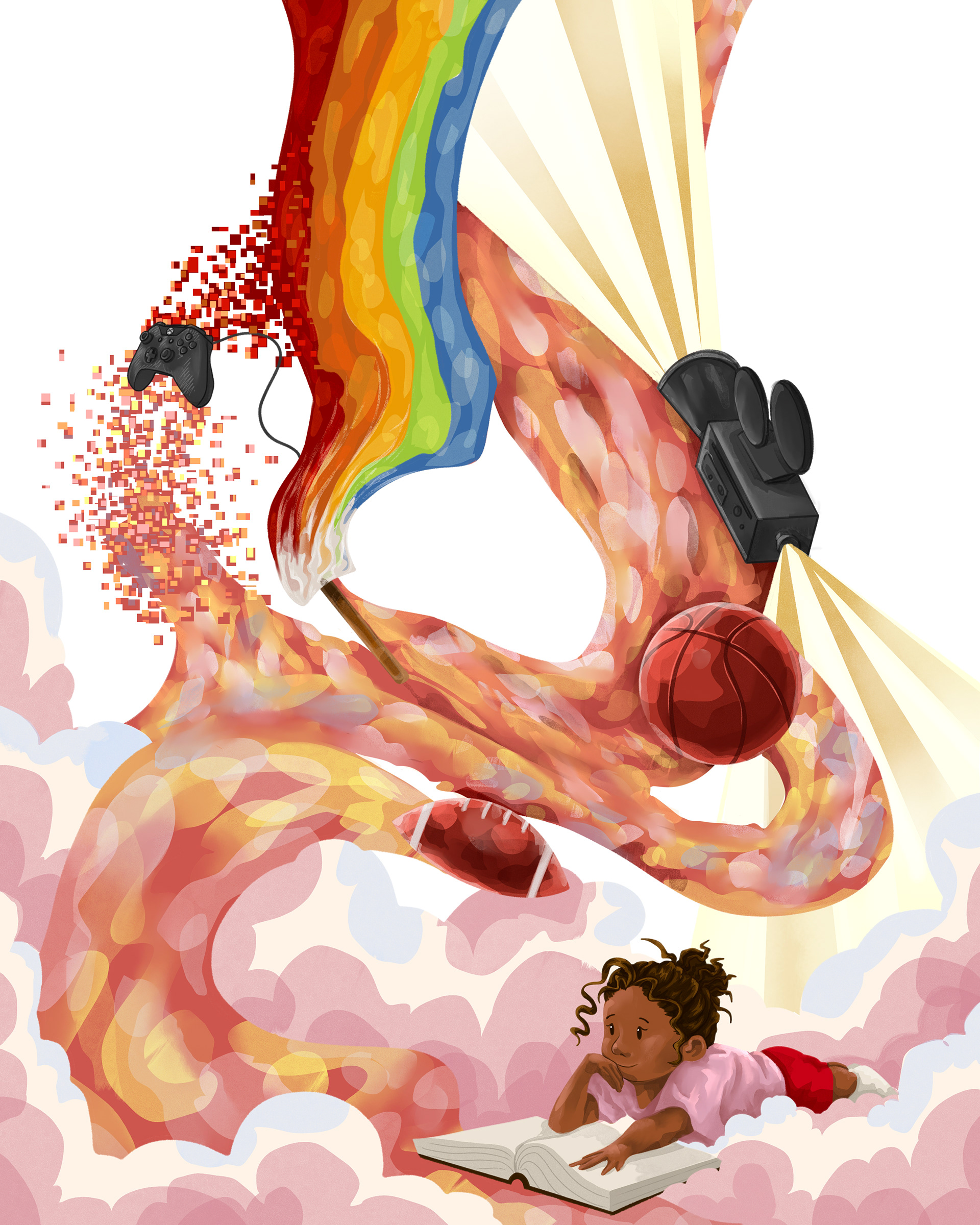
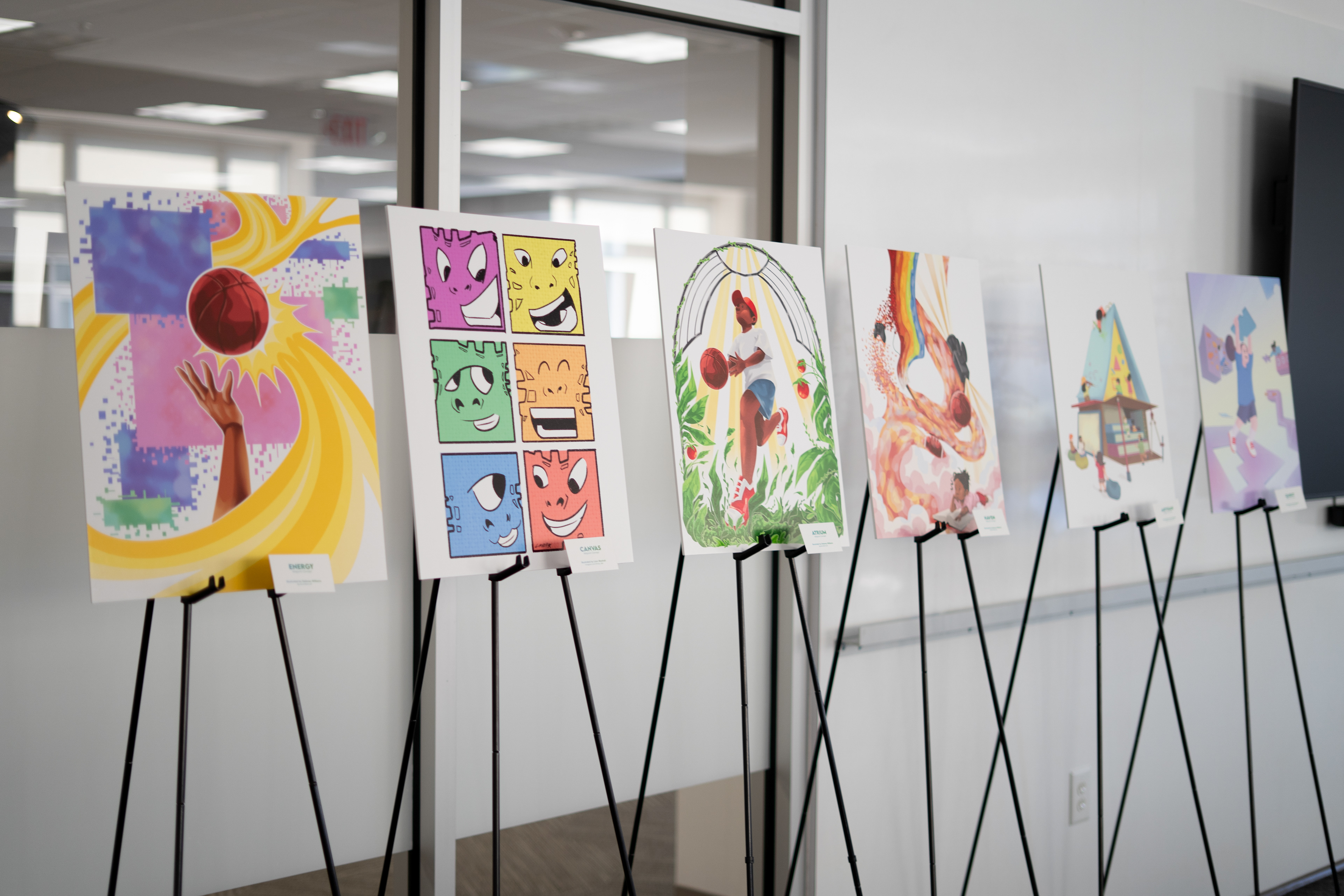
After conducting intensive research on the two Salvation Army locations and their demographics, pain points, needs, current assets, and interests, we developed three concepts for each location. The concepts varied in budgetary, time frame, and level of construction required across both the Peachcrest and Bellwood locations. The illustration team created posters for each idea in order to immediately visually communicate the aesthetic and direction of each concept.
Peachcrest

"Atrium" "Artisan" "Energy"
Delaney Williams Dan Nguyen Delaney Williams
Bellwood


"Quest" "Canvas" "Haven"
Dan Nguyen Liam Munhall Delaney Williams
Final: Refinement of Selected Concepts
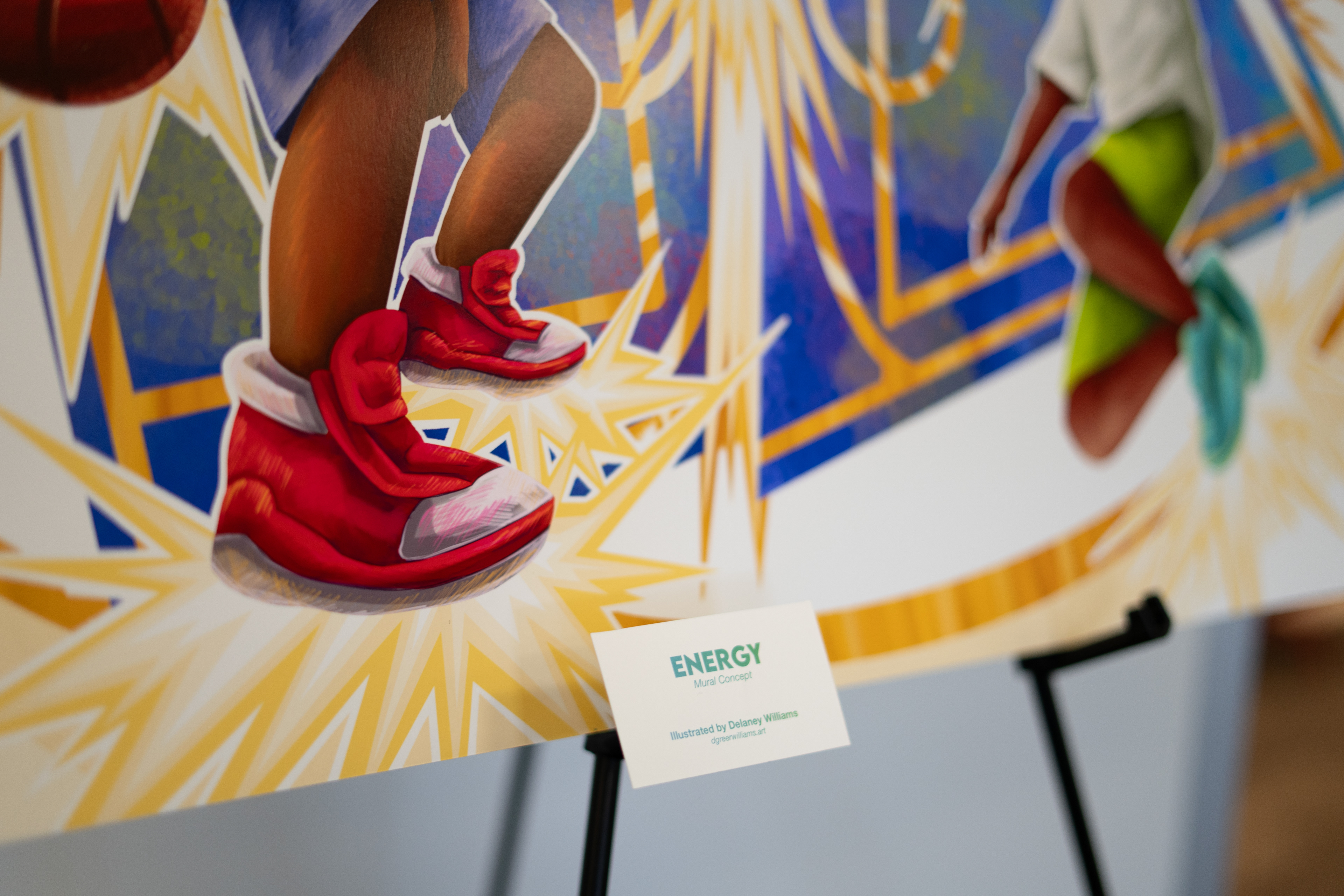
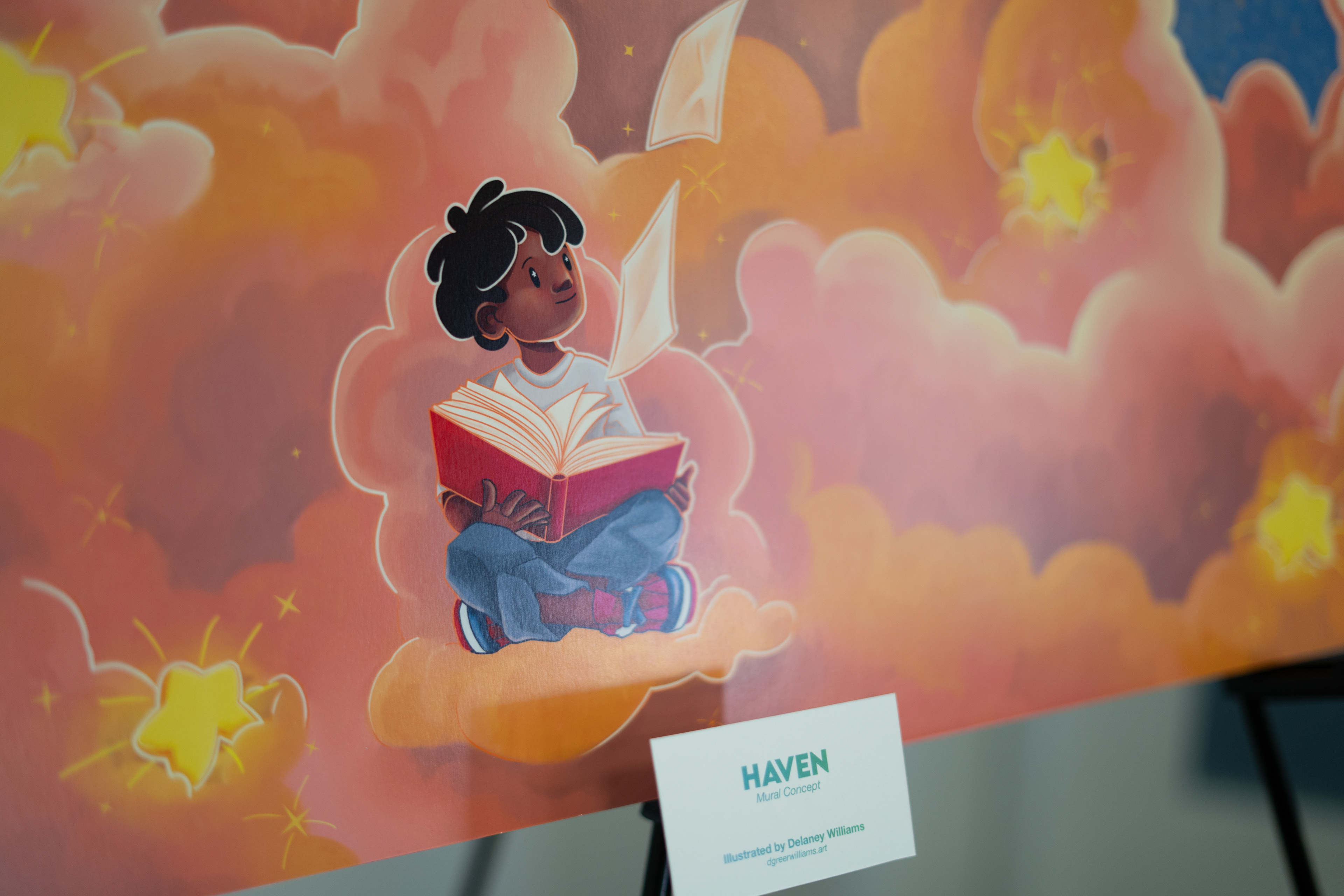
After the clients selected 'Energy' and 'Haven', respectively, our team moved forward with further defining each concept and making them fully realized plans. I created a mural for each location, both to further support the visualization of and connection to our ideas, as well as suggestions of how the spaces could be decorated. Additionally, our surface designer, Lillie Calixte, created individualized patterns that further enhanced the brand identity and served as presentation assets. Finally, myself and fellow concept designer, Dan Nguyen, imagined, designed, and illustrated what the spaces would actually look like in each location.


Mural concepts I created for "Haven" and "Energy".
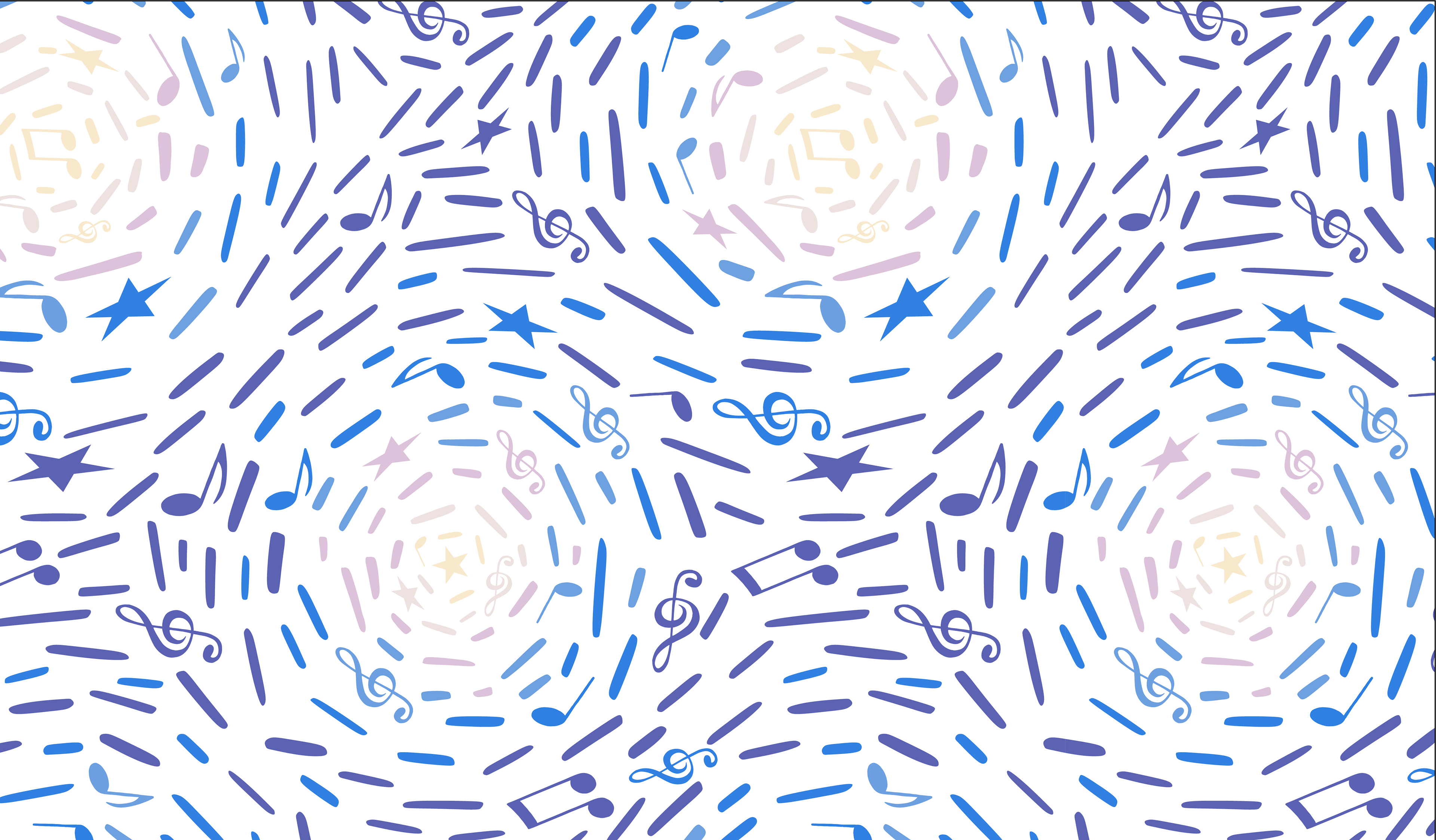
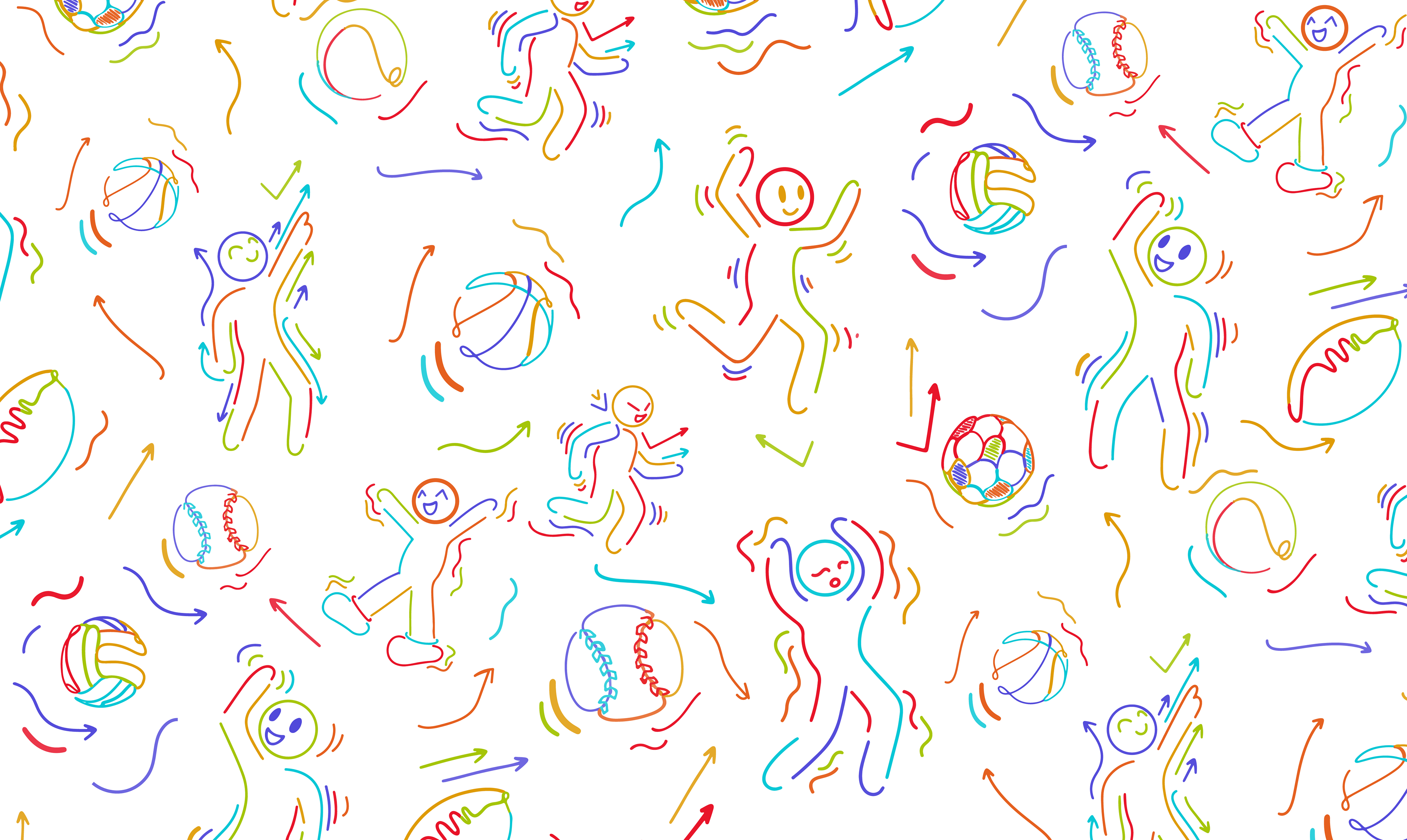
Patterns created by Lillian Calixte for "Haven" and "Energy".
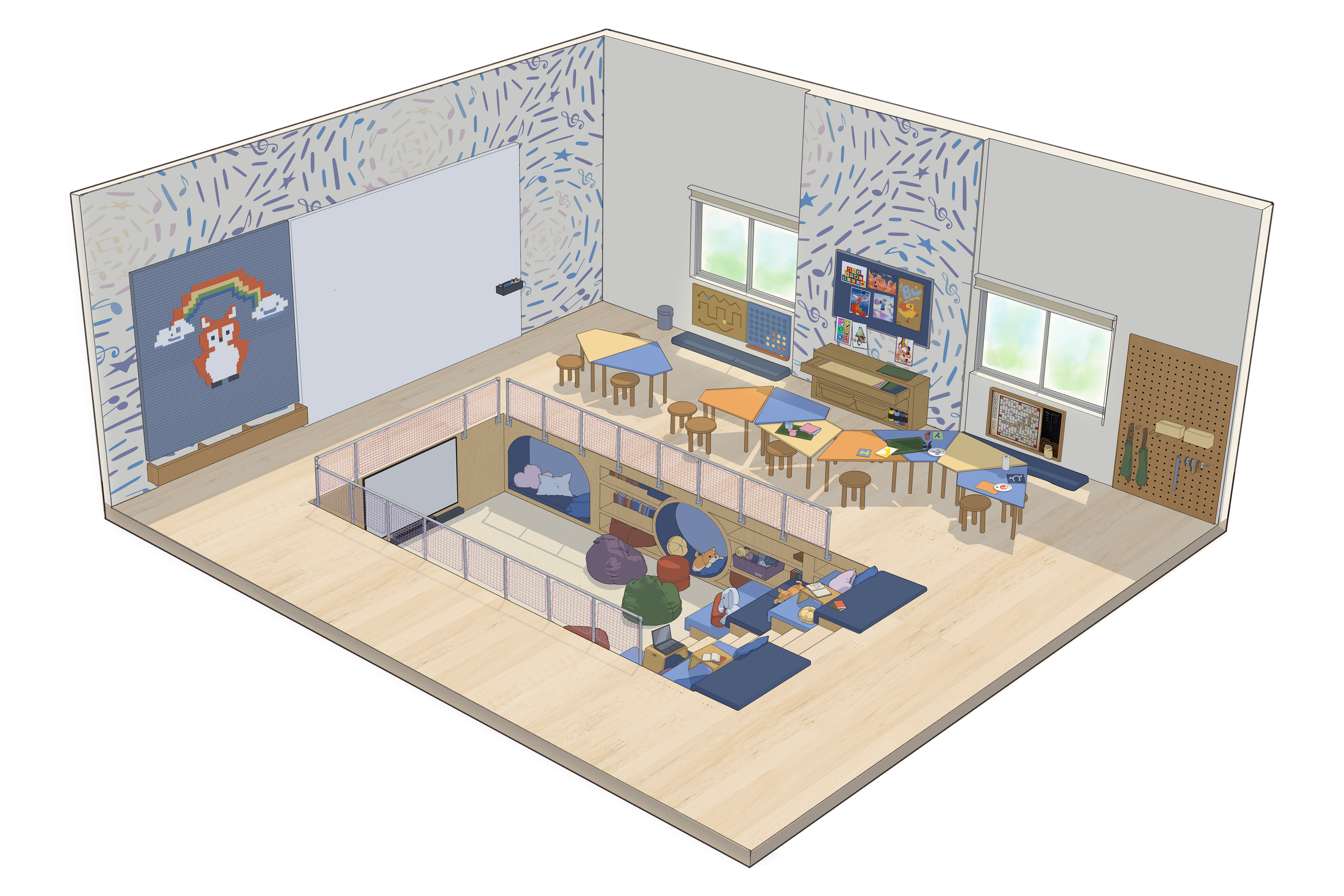
Final room concept for "Haven" created by Dan Nguyen.
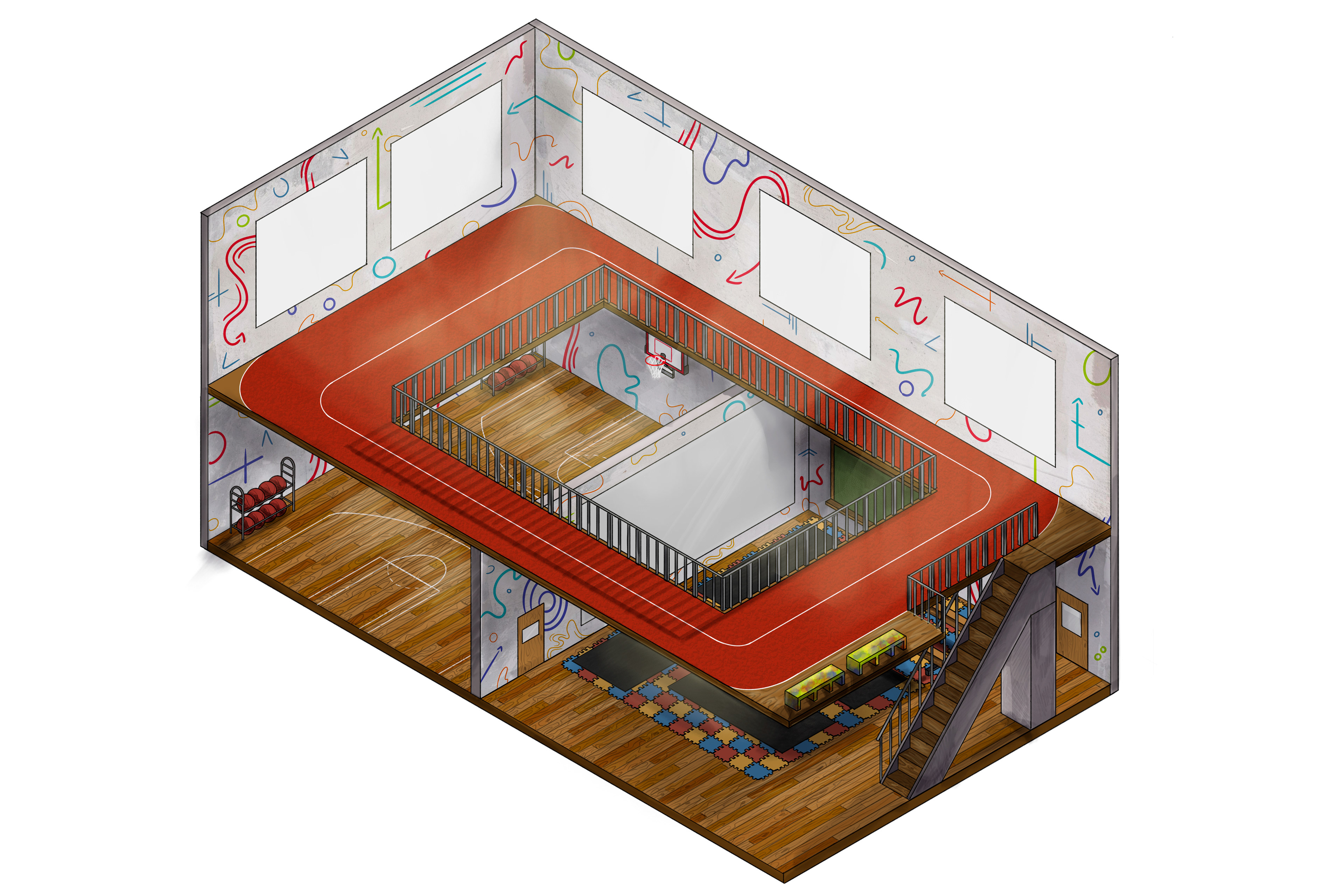
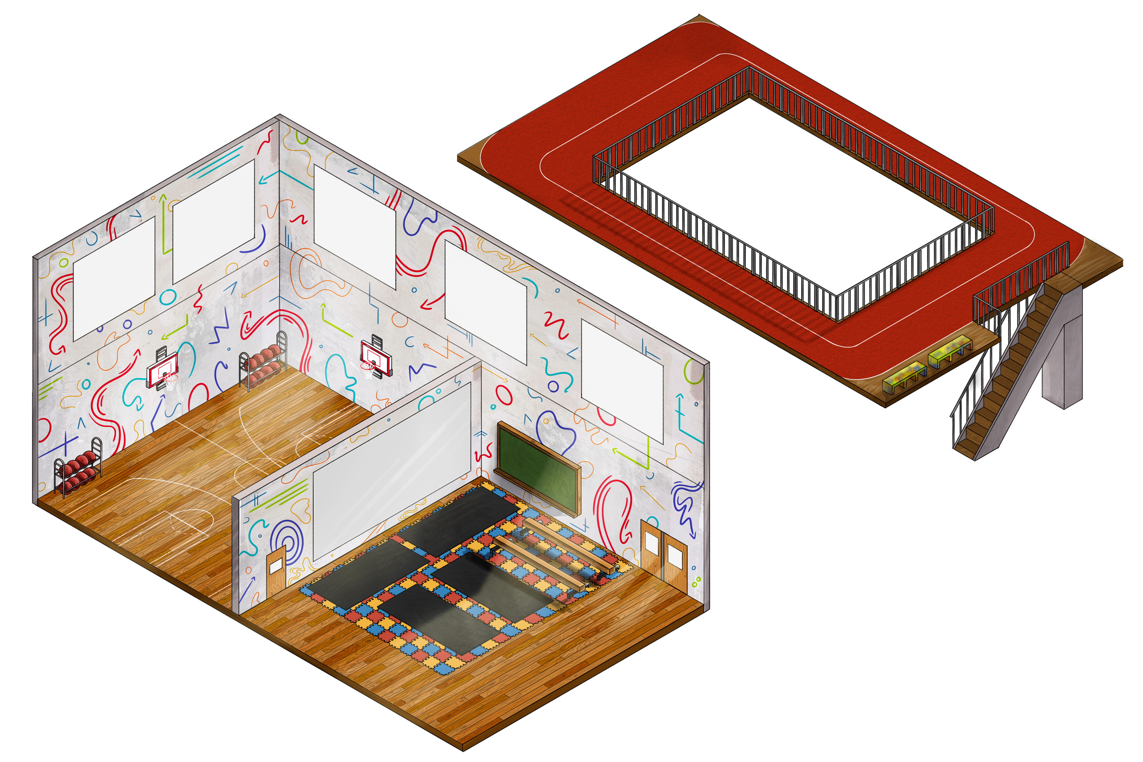
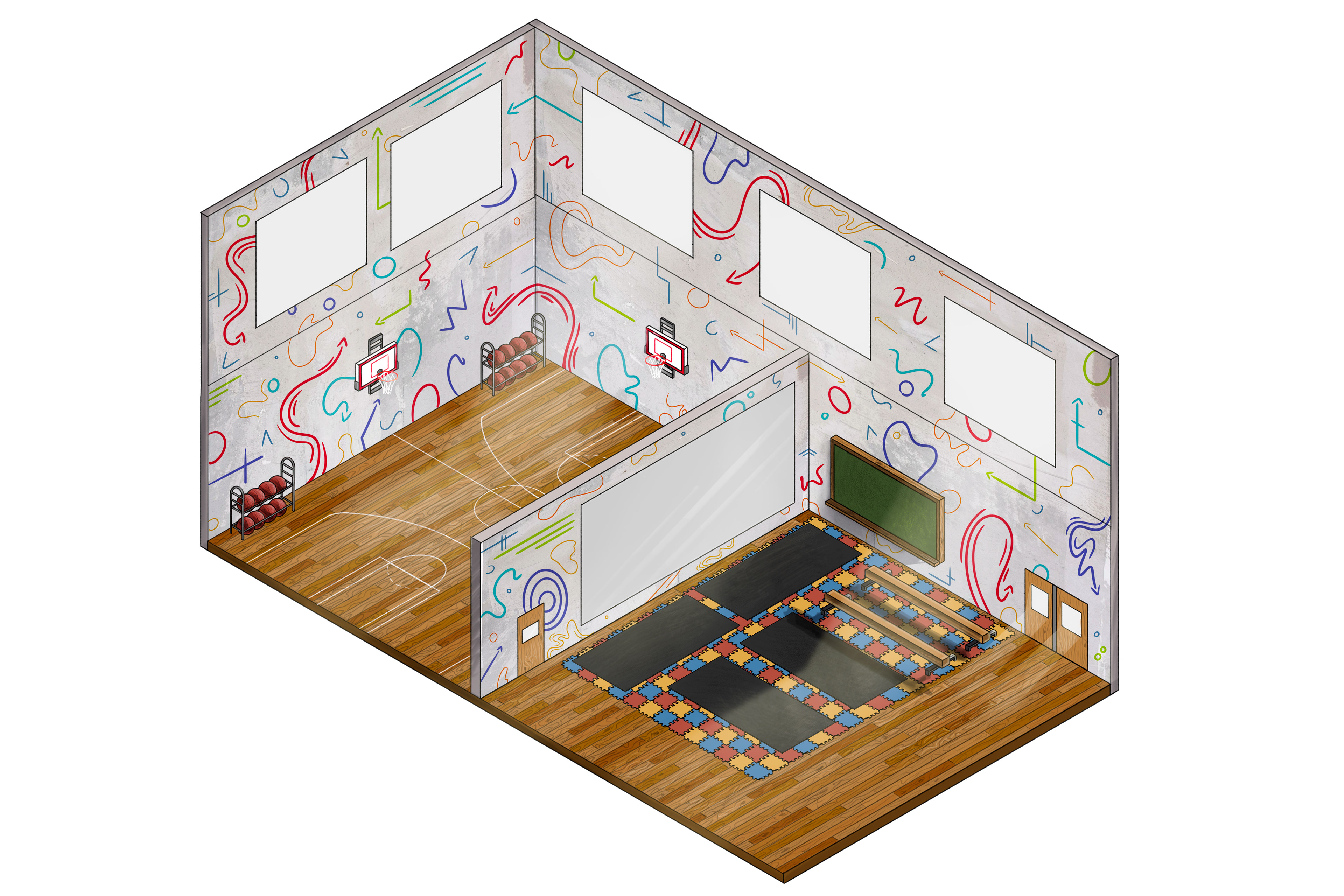
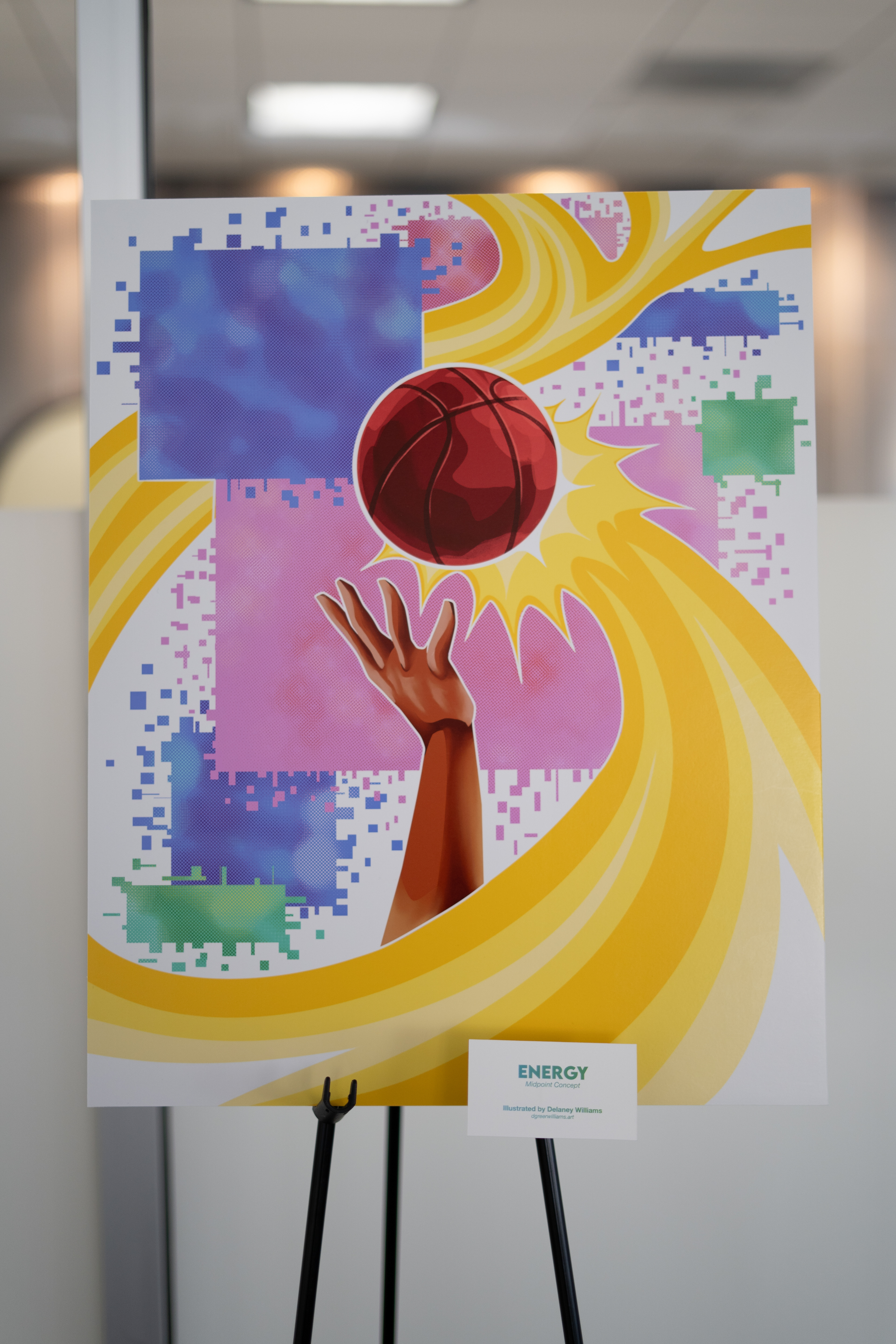
Final room concept I created for "Energy".
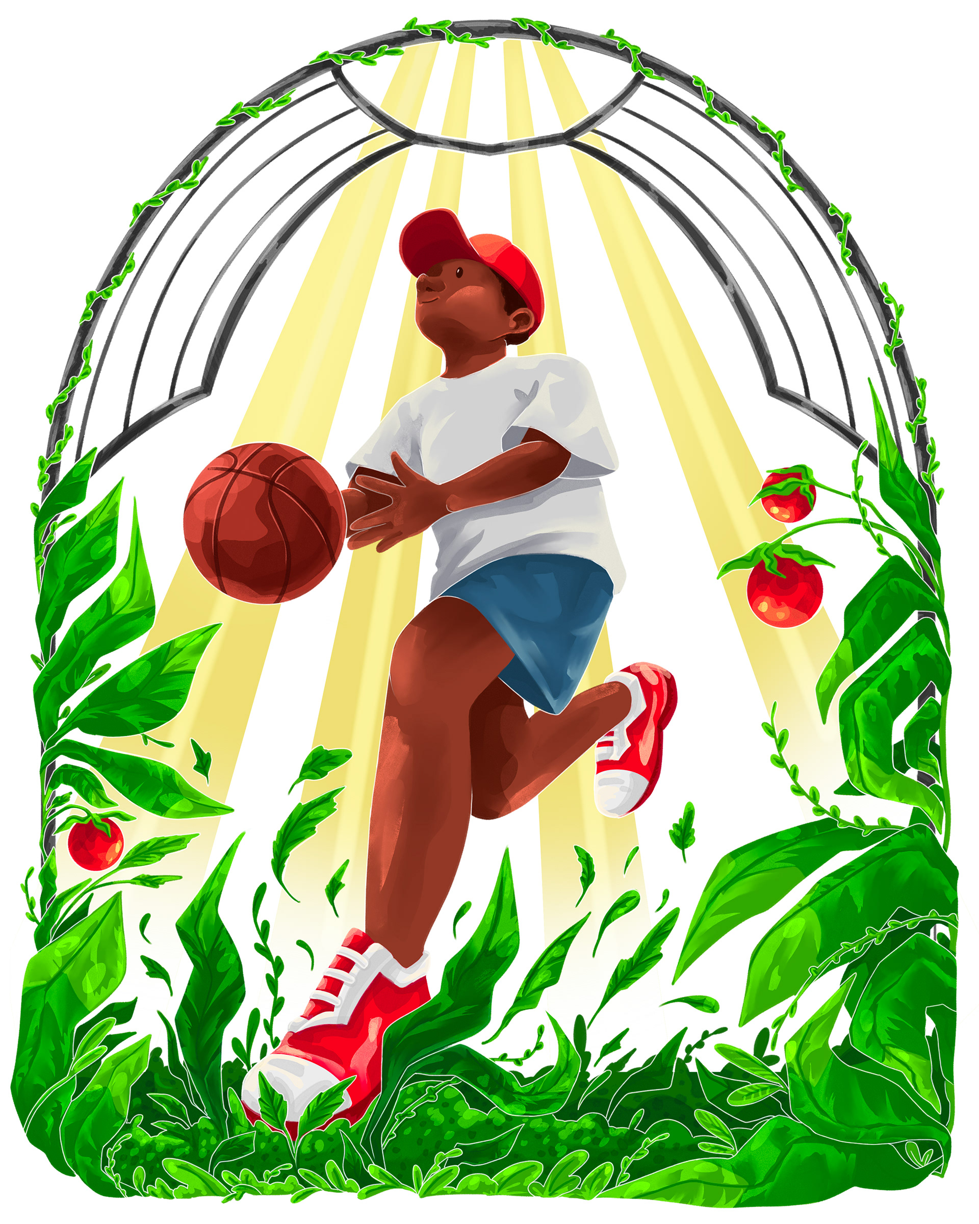
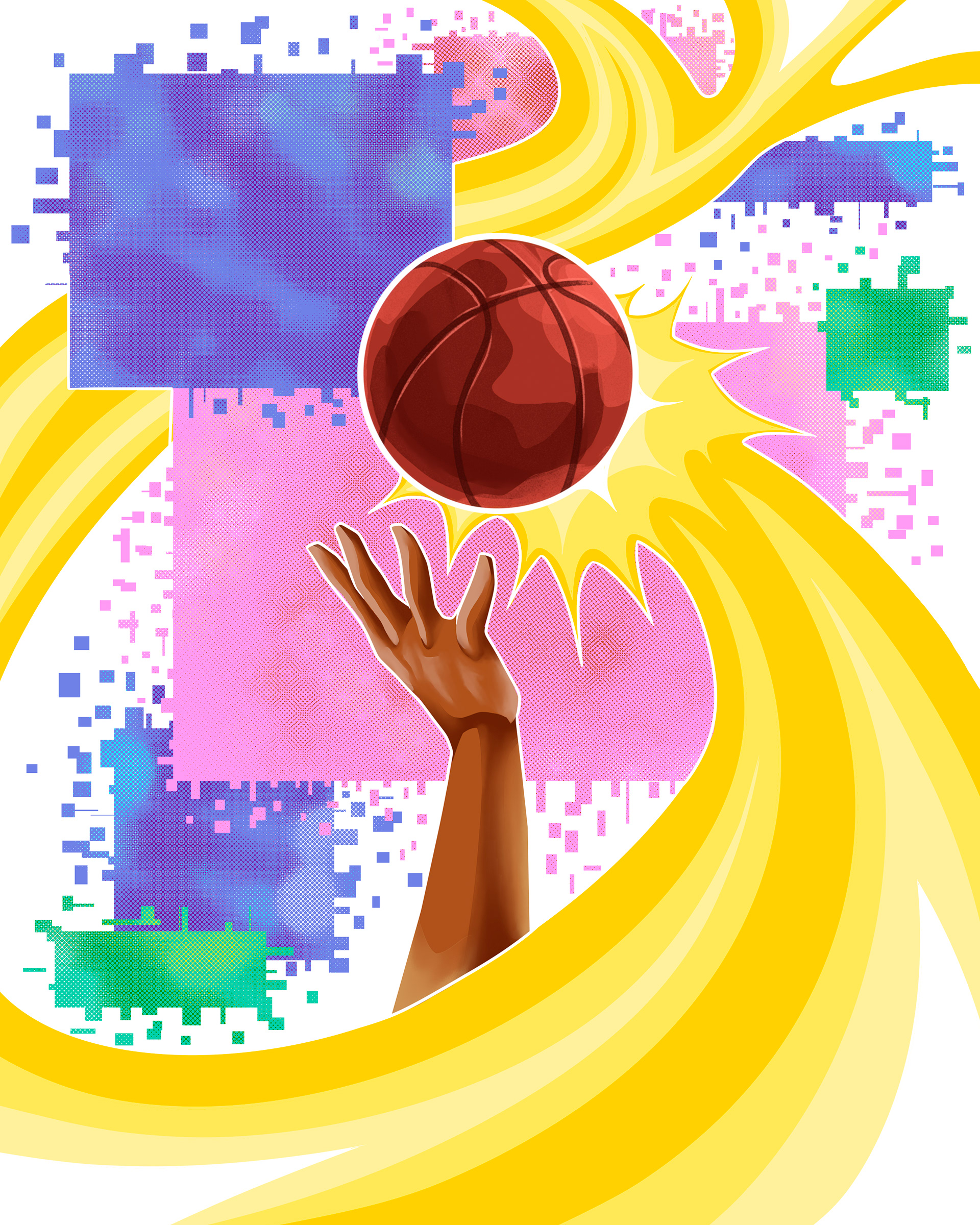
Energy is a vision motivated by Peachcrest's current studio space to create a dynamic, high-energy environment that offers kids more options to stay active year-round. By adding two additional gyms with modular walls and athletic surfaces such as hardwood floors, a running track, turf, and gymnastics mats, they'll have a versatile space that can accommodate their existing programs (taekwondo, dance, fitness, and sports) all in one place. This expansion would create more room for the 60-70 kids seen daily and provide an energetic, inspiring atmosphere. Bright colors, bold textures, and playful illustrations will make the space exciting the moment kids walk in. Energy is designed to grow with them, offering fun and engaging activities that never feel limited, no matter the season or weather. Expanding this space means more activities, more members, and more year-round engagement, keeping kids excited, connected, and eager to return.
When presenting the final concept to our client, I had to ensure my design clearly visually communicated the endless possibilities, fun, and opportunities that this new space could bring them. Additionally, while it had been mentioned that a 2nd-level track was an interest of theirs, budgetary and construction concerns meant that my design had to work both with and without a 2nd level.


Final client presentation gallery.
Personal Advertising Work:
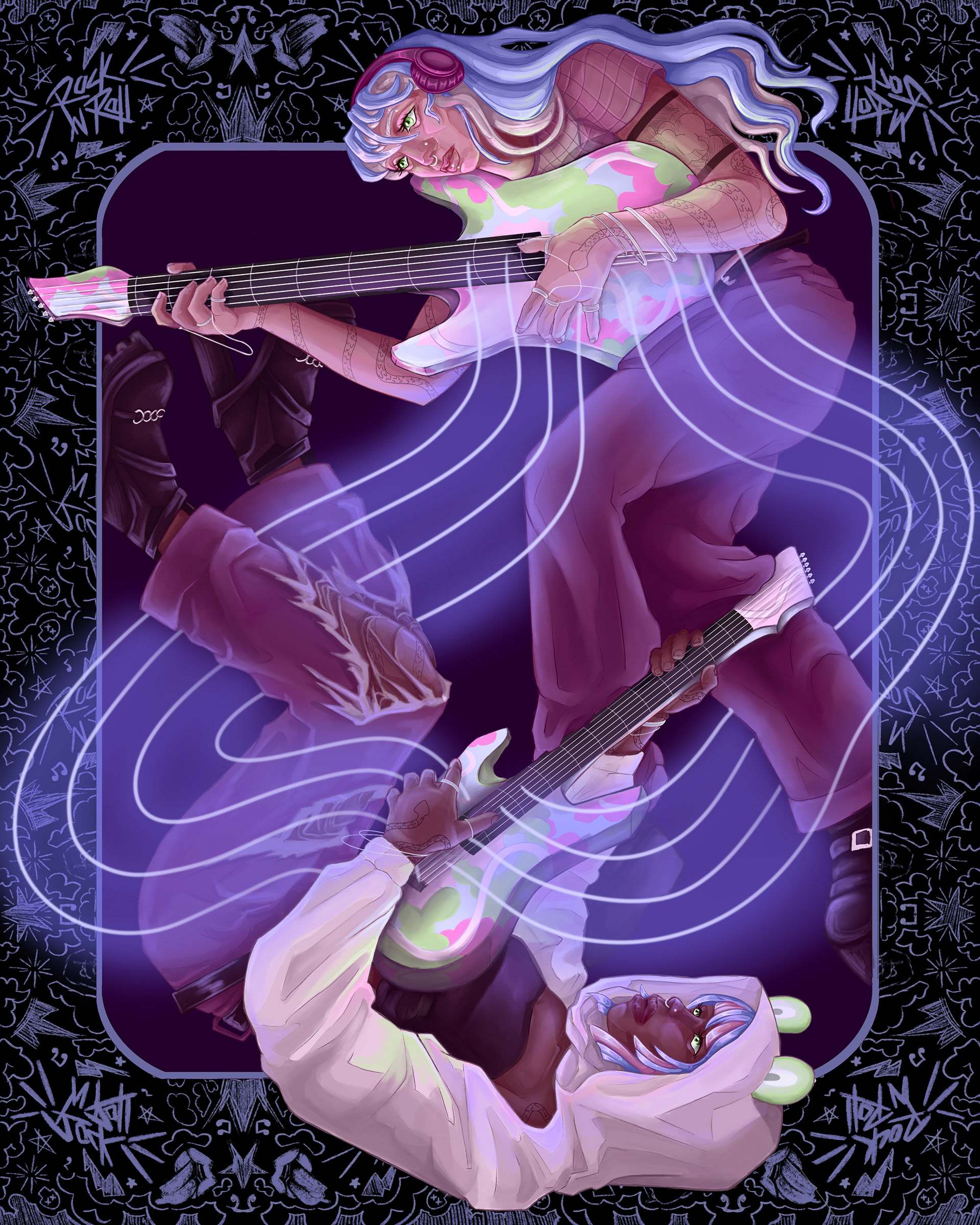
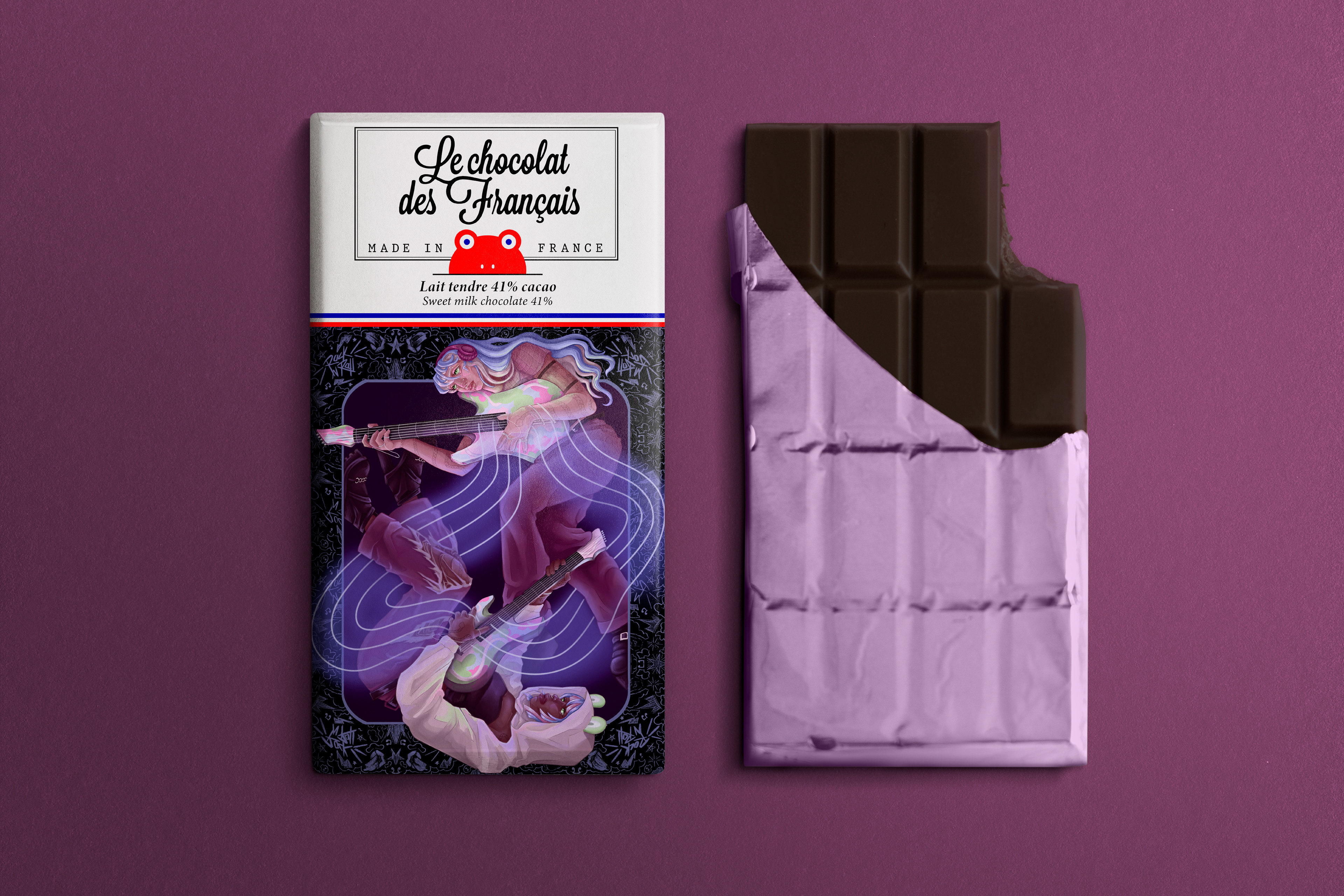
Le Chocolat des Francais Chocolate Wrapper (2024)
For this assignment, the instructions were to create an illustration for the brand's chocolate wrapper- but I had to pick one of my favorite songs to use as inspiration. Overall, the intention was to imitate chromesthesia, a condition in which a person sees colors while listening to a sound, in order to match the surreal illustrations the brand typically utilizes. The song I chose was "Am I Dreaming" by A$AP Rocky, Metro Boomin, and Roisee. This illustration and its color palette is a visual representation of the feelings I experience while listening to this song. I highly recommend giving it a listen yourself!
8" x 10" in Photoshop.
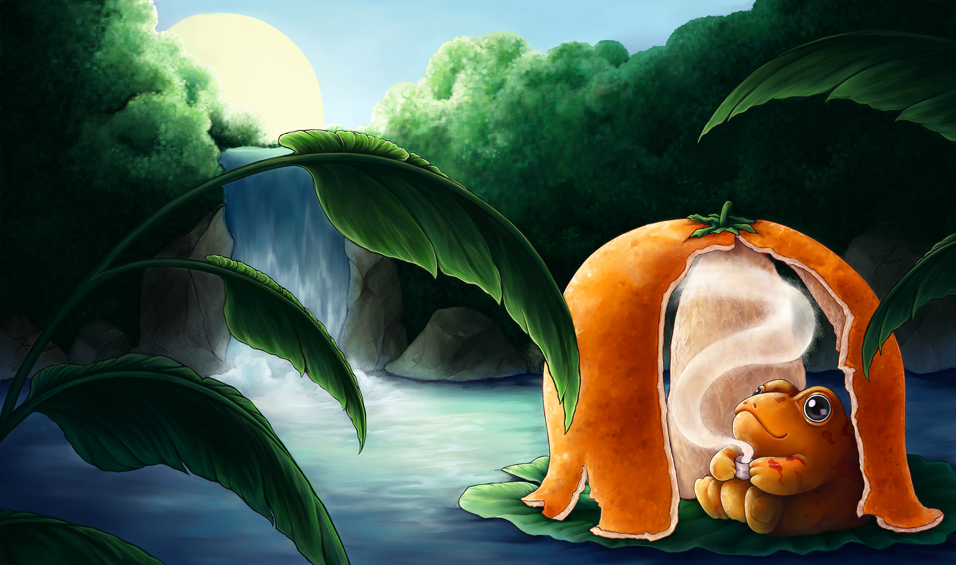

Celestial Seasonings Tea Co. (2024)
For this project, I chose a flavor of Celestial Seasonings Tea and redesigned the box illustration. My illustration for Mandarin Orange Spice combines the wholesome and cozy nature of the brand with my love for fantastical creature design. This piece can function as a complete work on its own or can be cropped to fit the label of the box.
11" x 6.5" in Photoshop.
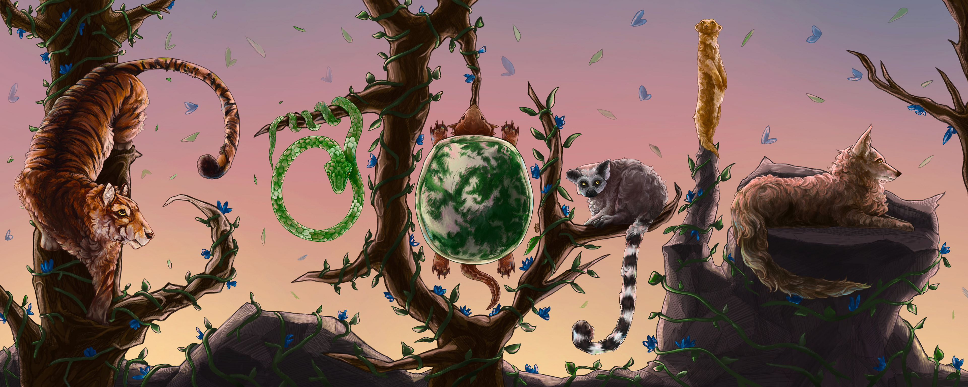
Google Doodle (2024)
For this assignment brief, I was instructed to create my own Google Doodle- a spontaneous graphic that replaces the logo on the Google homepage on special occasions. So, I had to first choose a specific holiday, then come up with a creative way to integrate "GOOGLE" into an illustration that represents the holiday. I decided to depict Earth Day (April 22) with a diverse group of animals spelling out the word. Each Google Doodle is unique and has a different style- so it was fun for me to be able to freely put my own twist on this fun tradition.
15" x 6" in Photoshop.
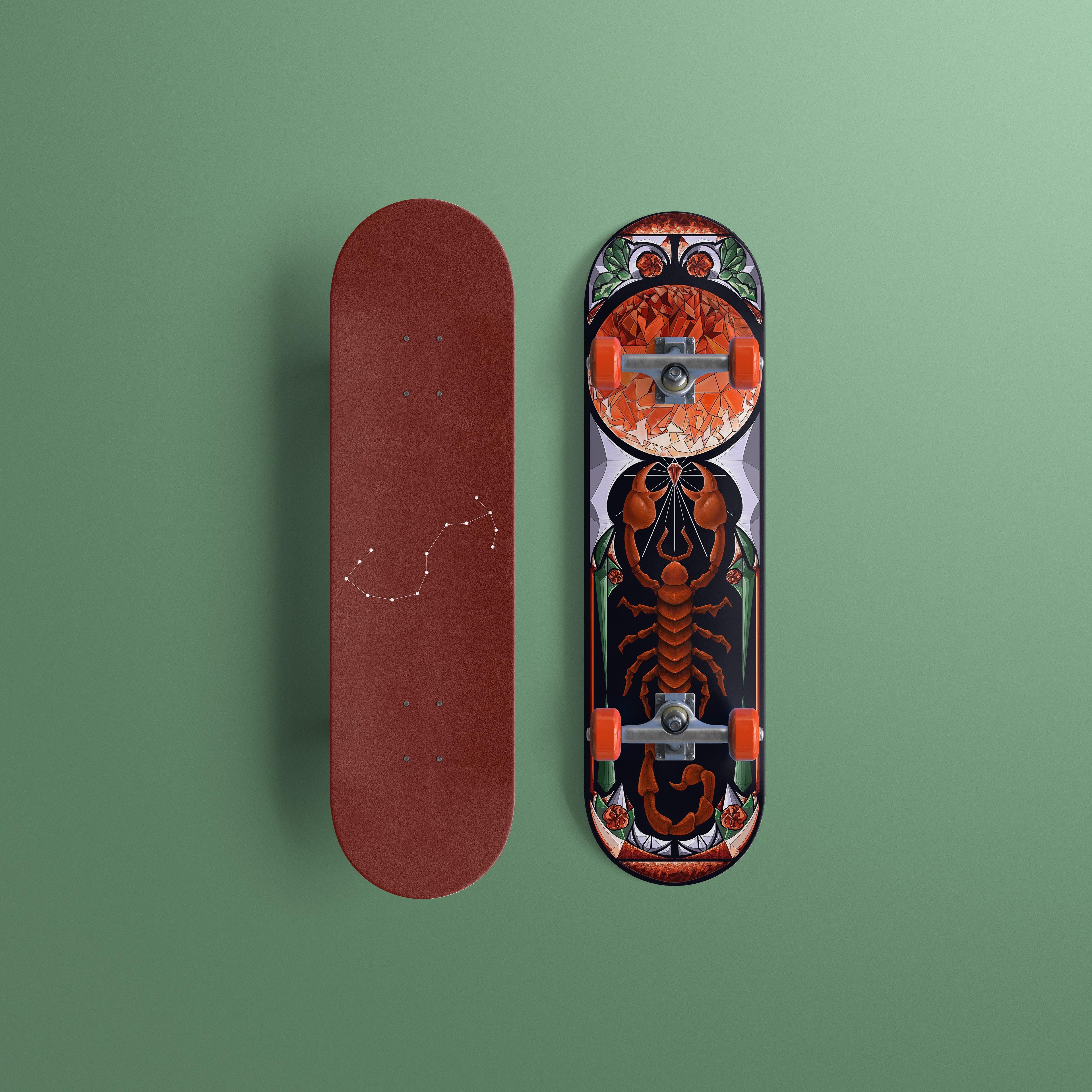


Land Yachtz Skateboard Decks (2024)
This assignment asked for a pair of illustrated skateboard decks that represent my ascending star sign (Scorpio) and my zodiac sign (Leo). Land Yachtz has a variety of different styles of artwork available on their boards, but it is overall very bold and eye-catching, so I focused on emulating that in my pieces. I ultimately chose to go with a bit of a graphic, stained-glass inspired aesthetic that showcases elements of my two zodiac signs.
4.065" x 15" in Photoshop.